What are rasters?
In short, any image is a raster. They can be produced in different ways, for example by computers, cameras or sensors. Here I’ll concentrate on rasters made by remote sensing: by satellite imaging, pictures taken by planes or drones. The sensor (in a camera for example) calculates different wavelengths radiating from the surface of the Earth, and this information in saved as a raster.
The well known divide in spatial data types is rasters and vectors. While vectors can be points, lines or areas, rasters are made of pixels. These pixels have some kind of coordinate information in them. This means that the image consists of these small (or bigger) squares called pixels that have some sort of value to them. In most cases we see them as colours. Pixel size varies from image to image and the smaller the size (the less area one pixel covers) the sharper the image is.
All the pixels have some kind of numerical value that typically refers to the brightness or intensity of the pixel.
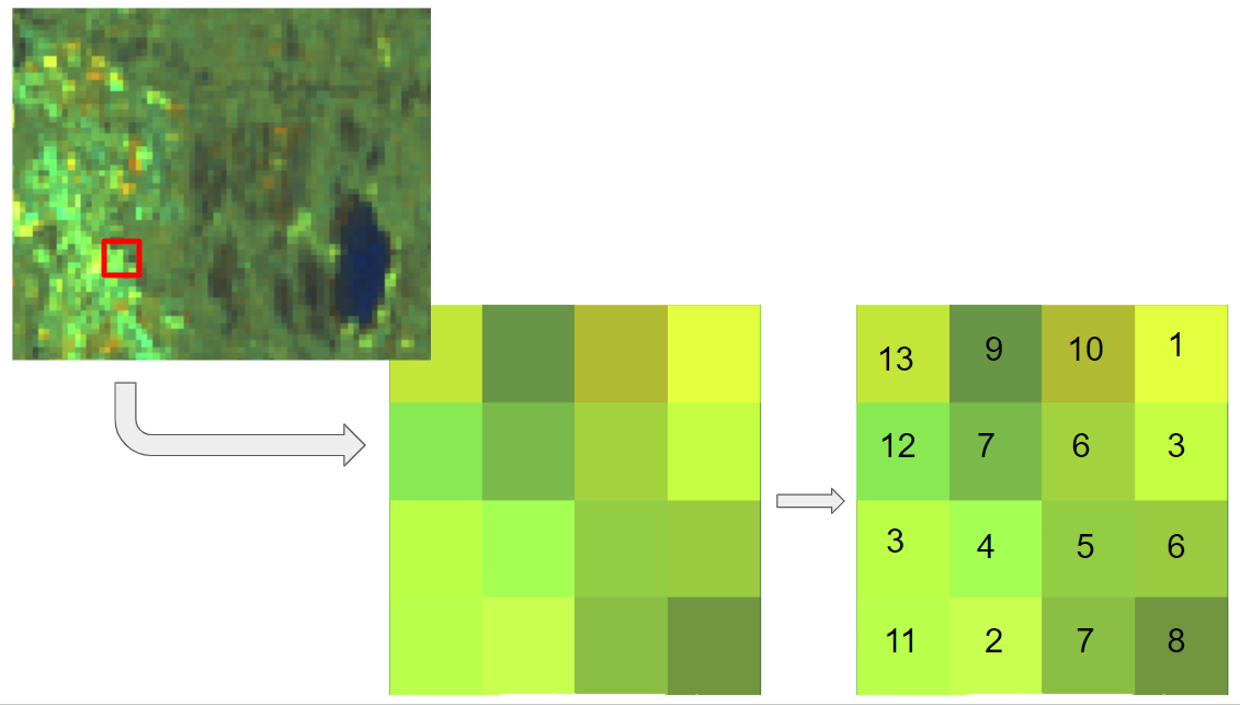
In spatial data rasters can hold a lot of information in large scales and they are good for visualising continuous data, for example vegetation or land cover. The downside is that they are quite a lot bigger in file size than vector files. The sharper the image (the smaller the pixel size) the larger the file is going to be.
Visualising multiband images
Satellite images usually consist of multiple different bands that measure different parts of the light spectrum. Different satellites measure different bands, for example in Landsat 8 there are 11 bands. These include for example normal red, green and blue bands and a few different infrared bands: near, shortwave and thermal. More on these in here. When visualising a satellite image we usually need three different bands to make the image: red, green and blue. This combination in this order makes what we see as normal looking image like this:
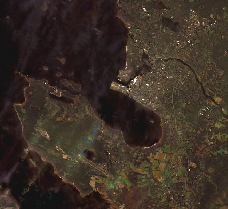
This satellite image is from Landsat 8, downloaded from Earth Explorer. Image is from June 2023 above Oulu, Finland. Here all the different areas, city, forests, fields and sea are visualised quite well. The white streaks in the image are clouds.
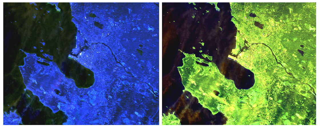
If we switch the order or the bands used in visualisation we end up with different kinds of images. For example that same image in two different combinations would look something like this:
Different satellites have different sets of bands and the bands (more exactly their wavelengths) might differ a bit from satellite to satellite. NASAs Landsat satellites might be the most known but there are also European Space Agency’s (ESA) Sentinel satellites. These bands are images of specific wavelengths reflected from the surface of the Earth. All the bands have specific spectral coverages, for example in Landsat 8 and 9 bands 6 and 7 are targeting vegetation. With new sensors and satellites we’ll get more spectral coverage.
Well what’s the point with stacking different bands together?
Combining bands in a specific way can help you to visualise different things in the satellite image. For example if you have a Landsat 8 image and you want to see the vegetation more clearly. Using bands 6 for red, 5 for green and 4 for blue gets you a false colour image that is best for vegetation analysis!
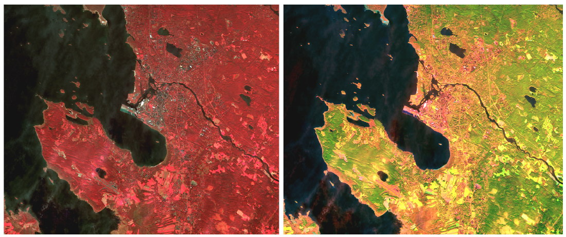
Here on the right is the previously mentioned false colour image for vegetation analysis and on the left there is colour infrared for urban using bands 5, 4 and 3.
With false colour for vegetation analysis we can see fields in different states of growth in different colours, swamps and maybe different kinds of forests. With the false colour for urban areas we can see the built areas highlighted.
There are many different ways to combine different bands to get different information out of the satellite image. Here are some examples with Landsat: https://www.usgs.gov/media/images/common-landsat-band-combinations
Along with visualisation helping with analysing your satellite images, there are many tools in QGIS and AI to help you to get the most information out of your satellite images!
In the next part of this raster series we will talk about Raster Analysis.
Contact us if you need help with working with your rasters!

