The #30DayMapChallenge as a team
It has become a tradition here in Gispo to take part in the #30DayMapChallenge as a team. So we did again this year. Participating in the challenge gives an opportunity to explore something you’ve never done before, or make the map you’ve always wanted to make. You might also end up googling the colour codes for neon colours.
Great ideas and not-so-great data
We asked our team what sort of difficulties they run into while making their maps. The biggest challenge (if time deficit isn’t counted) seems to be finding the great idea if you don’t already have one. The second greatest hurdle is how a great idea of a map can be ruined by lack of data. How wonderful it would be to have open data on just about anything you can think about, and the data would be perfect and up to date! But in this reality we make do with what we have.
Other sources of difficulties included lacks in the skills and tools, the size of the data, and language barriers. Sometimes the skills of the map maker didn’t coincide with the vision of the said map maker. It is rather frustrating not to be able to do what you want, but on the other hand it is a great motivation to learn more. Even when you have the skills it may require meticulous work to reach the result you envisioned. Especially if you are very strict about what kind of symbols and fonts you want for your map – you might end up creating your own symbols to get what you want!
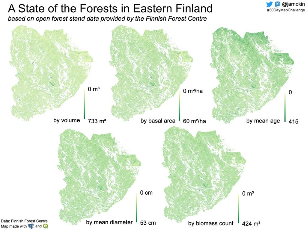
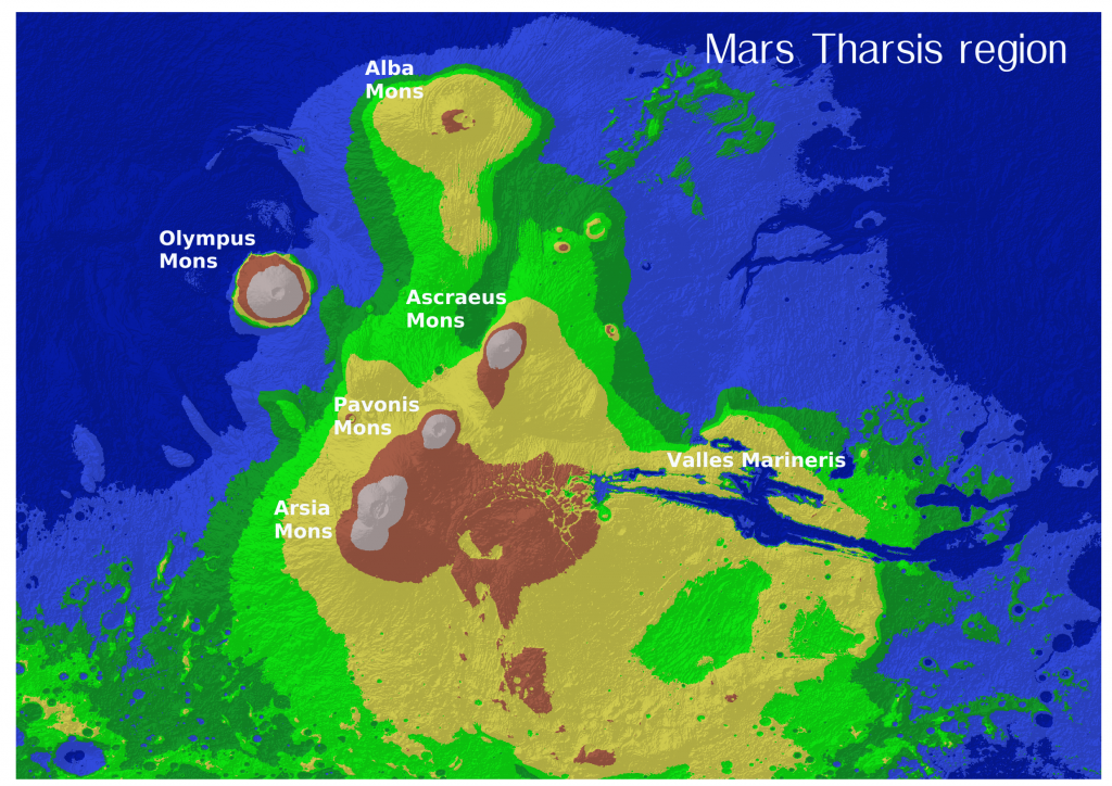
Whether the data is about space or Finnish forests, the size of the data set can be one source of difficulty as our map makers on days 4 and 9 of the challenge learned. Also when you leave the Earth and use data from Mars, it is much more difficult to find proper projection. Similarly, our map maker on day 22 had issues with projection as they would have liked to create a new projection.
Language barriers and headaches
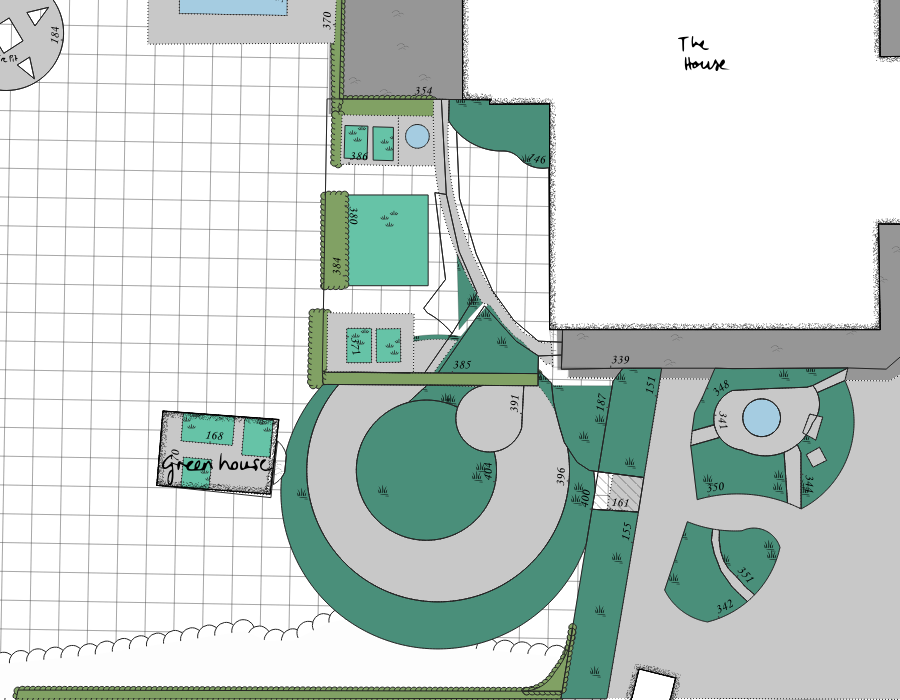
The day 3 polygon mapper was longing for more developed digitising tools in QGIS. When an object changes, it is not very easy to do the changes in QGIS. Especially the curves and overlapping polygons can be difficult to update.
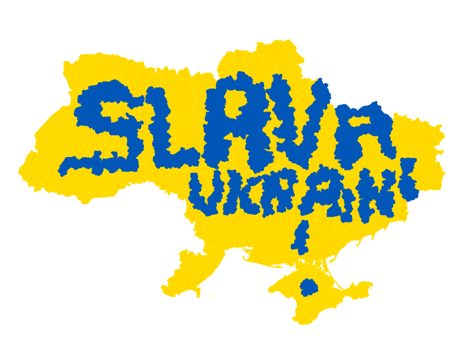
Language barrier turned out to be a slight challenge with Ukranian and Icelandic data (days 5 and 26). Finding the data and then figuring out what it is about and what kind of licence it has, would have been easier had the map makers been fluent in the native languages.
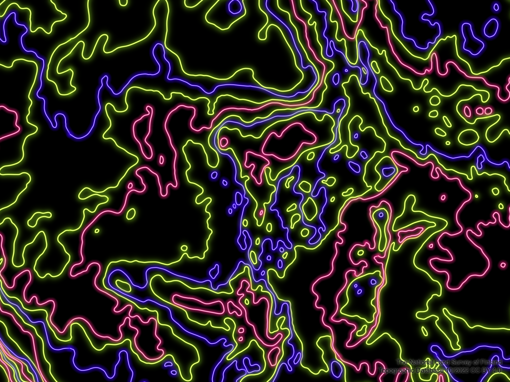
One more difficulty worth mentioning is the neon light effects and how looking at those for longer periods of time may cause headache.
As a team effort we finished the #30DayMapChallenge 2022, had fun doing it and also learned something new!
