Exploring cities with Gispo urban analytics
Introduction
Spatial data about cities is vast, both in terms of volume and variety. However, any single dataset by itself is usually insufficient to give much of an idea of the dynamics that make up an urban area. This is why combining data not only from multiple sources but also of multiple subject areas is most likely required when analysing a city. The hardest part of an analysis process, thus, can become the search for these datasets, not to mention the challenge of combining them in a meaningful way.
Gispo’s urban analytics tool aims to ease the process of acquiring and analysing urban geospatial data. The basic idea behind the tool is simple: The user selects an area to analyse and what datasets to import, then the tool imports, analyses and combines all of the data producing a map of the analysis area as an end result. What the resulting map depicts of course depends entirely on what component datasets were selected.
In this blog post I explain the functionality of the tool – what datasets are available to use, how they are used and how the end results are presented. While I focus on Helsinki here, a key design principle of the tool is scalability regardless of place. So, whether you’re analysing Tokyo or Reykjavik, the data sources and the functionality of the tool remain the same.
The input datasets and their roles
When developing the tool, three different data themes were selected: urban activity, accessibility and demographics. We then picked the data sources with these themes in mind while also prioritising the goal of all data being available globally and openly. Below is a rundown of the datasets used, supplemented with some exploratory visualizations done in QGIS.
Theme 1: Urban activity
Data sources: OpenStreetMap, Flickr
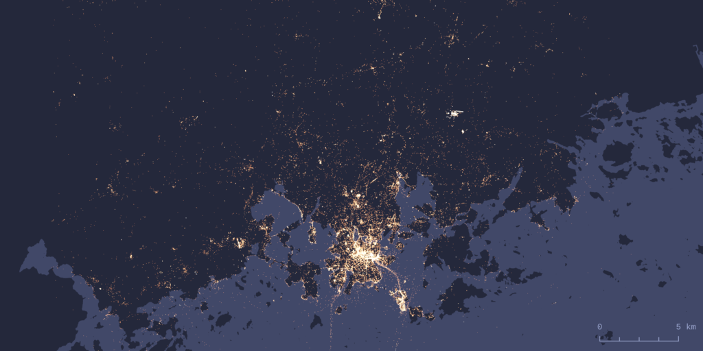
Out of the three themes, urban activity is probably the hardest one to define. We ended up selecting two datasets here: OpenStreetMap (shortened to OSM from now on) and Flickr. Using OSM as a data source is quite self-explanatory considering the aforementioned data requirements. However, a lot less self-explanatory is the question of what exactly are the OSM features that indicate urban activity. The types of features we decided to use are based on examples from scientific literature, with supplementing feature types added based on our own validation of the tool. The resulting selection of feature types focuses mainly on amenities, shops and leisure-oriented features.
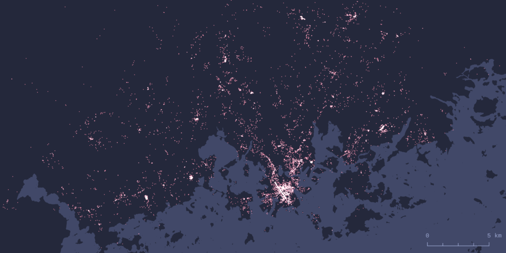
To get a different view of activity, we used Flickr image metadata. Flickr photo locations have been used widely in urban research, for example to detect spatiotemporal patterns and areas of activity. Flickr also offers an open API for accessing their data, which makes it possible to download these image locations.
Theme 2: Accessibility
We included two different methods of transportation for modelling accessibility: public transit and walkability. For public transit analysis the choice was to use GTFS (General Transit Feed Specification) data. This makes sense as GTFS is a widely used standard format for sharing public transportation schedules and associated geographic information.
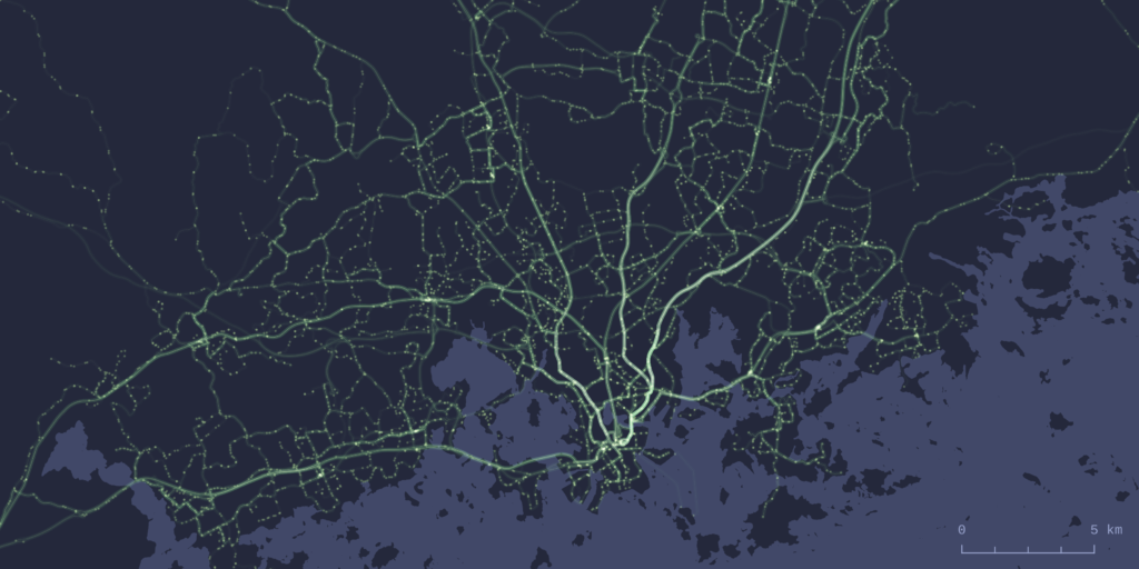
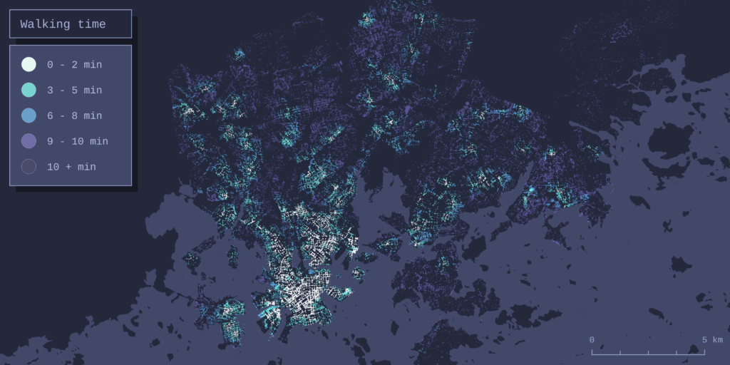
To model walkability the tool performs a network-wide routing analysis on the walkable OSM street network of the area being analysed. In practice this means calculating walking times from every node in the street network to the OSM features described earlier in the activity section. For a deeper dive into analytical methods the tool uses for routing analysis, see this earlier blog post.
Theme 3: Demographics
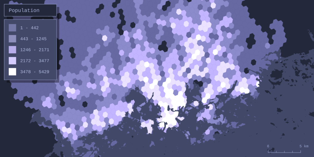
The datasets of choice for analysing population were the Kontur population grid and Ookla’s global Network performance dataset. The more conventional population dataset of the two, Kontur’s population grid, is an openly available dataset with global coverage and a spatial resolution that is fine enough for analysis even on a sub-city scale.
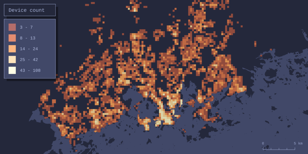
Ookla offers worldwide datasets of local broadband internet speeds and device counts gathered from the usage of their Speedtest service. The datasets cover the entire globe in a sub-kilometer resolution grid, thus giving a great measure of recent web infrastructure and internet user numbers.
The output – combining data and forming the result map
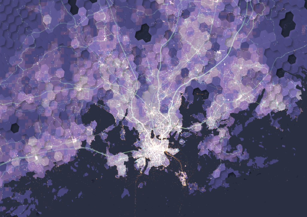
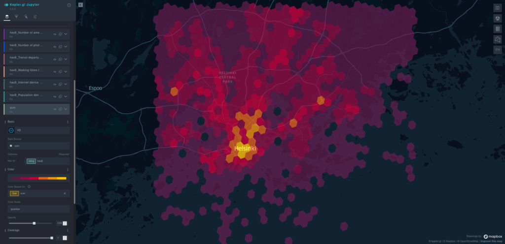
The h3 hexagonal grid system works as the basis for both combining and visualizing the datasets. All data is collected into the grid cells (hexagons), and each cell receives one value per one dataset. How this value is defined depends on the data: For some datasets the value is simply the sum of features within the cell – this is the case with OSM features, for example. Obviously this doesn’t work for every dataset. For example, the cells get their walkability value from the average walking time of all the network nodes in the cell, and the public transport value is determined by total daily departures, not the amount of stops, in the cell.
To make combining different datasets possible, the dataset-specific values are normalized to be in the range of 0-1. Here 0 means the worst value (for example longest walking times or the least OSM amenities) and 1 the best value (best accessibility, most amenities). The normalized values are then summed for each cell. If we’re importing all 6 datasets, the highest combined value a cell could theoretically receive is 6 (1 for each dataset).
This combined value is the variable that is visualized by default on the map the tool produces as a result. The result map is interactive, and it’s presented in a web browser using kepler.gl.

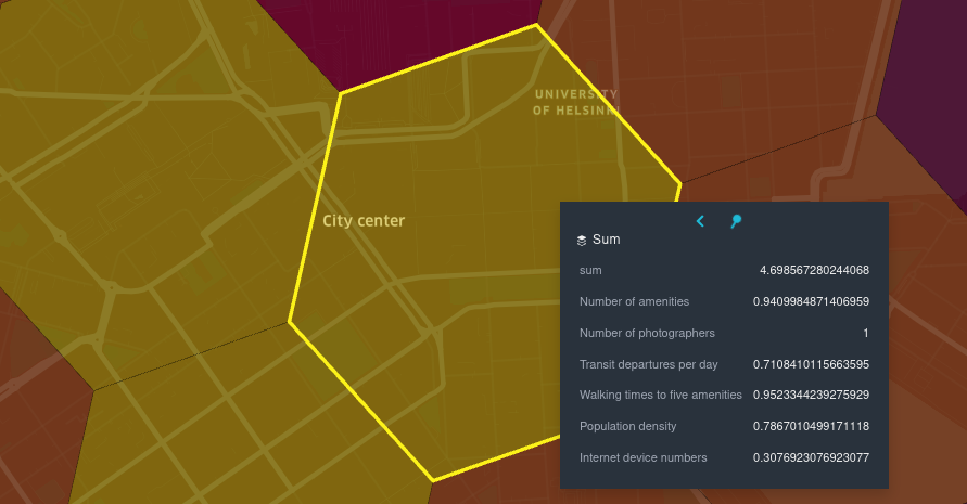
So what exactly does the combined value mean then? Since the combination of input data is user-defined, so is the meaning of the resulting map. For example, if all datasets are included in the analysis, the result can be thought of as an urbanity index of sorts, built considering all of the aforementioned aspects of urban space. But, any other combination of data is possible as well: If the user wants to, for example, form an accessibility-focused map, combining only the walkability and public transit datasets is entirely possible. After the analysis all datasets are also available to view separately in kepler, so comparing them as independent layers is possible.
Conclusion
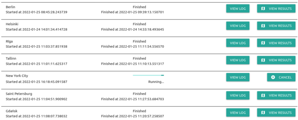
Gispo’s spatial analytics tool enables easily importing, analysing and visualizing urban geospatial data from anywhere in the world. All data is collected from sources that stay the same no matter where you run the analysis, resulting in a high level of interoperability and comparability of the datasets and analysis results between different locations.
Of course, this tool is not an all-encompassing be-all end-all solution to analysing cities. It excels at quickly getting an overview of any urban area by combining and simplifying a massive amount of data into an understandable, visually clear representation. Still, this representation is ultimately a simplification of something much more complex – whether this is a strength or a weakness depends entirely on the analysis case.
See for yourself!
Instructions on the setup and usage of the tool, along with all of the code, can be found in the project’s open github repository.
If you’re interested in taking a deeper look into the opportunities there are for processing, analyzing and visualizing different spatial datasets and you’re looking for a partner for the ride, consider reaching out (info@gispo.fi).
