The power of community: #30DayMapChallenge
New year has started, but it is still nice to reflect how I accidentally managed to reduce the productivity of the GIS global industry by a few percentage in November. This happened when 30DayMapChallenge went viral on Twitter and hundreds of people started making and publishing beautiful maps about different themes.
How things got started. And out of hands.
Like most days, I was browsing Twitter on my way to the office on the bus one morning late October. My feed had several beautiful #Inktober posts and I started thinking if a similar challenge could be done with maps. I asked for initial interest towards this kind of challenge and it got really positive response. The hashtag #mapvember was already used, so I chose #30DayMapChallenge.
So about a week later I spent roughly 15 minutes coming up with the categories. The vague rules in the tweet were invented on the fly while publishing the tweet. Looking back, I found it somewhat amusing how some participants started referring to these as the official rules of the challenge, although my initial idea was to keep everything as open as possible: anyone can join the challenge, anyone can leave the challenge and nothing is compulsory.

Soon after publishing the tweet with the categories, it was clear that people are really into the challenge. During the first day it got already dozens of retweets and there was no turning back. On the first day of November I was stunned when opening Twitter as people around the world were doing the challenge. This continued for several days and latest when I saw a tweet about the challenge being mentioned on Mexican TV, the challenge had really gone viral.
Global reach, stunning maps and amazing stats
The statistics were amazing and exact numbers vary slightly depending how things are counted. According to Tweepsmap the hashtag got more than 22 000 tweets in total with a reach up to 19 million (!) Twitter users. Huge credit for collecting stats aboutthe challenge goes to David Friggens, who created a whole website dedicated for the maps and stats around 30DayMapChallenge. To make it even better, he has published also the code for his site.
According to David at least 631 people had been tweeting using the hashtag and almost 3 500 maps were published by more than 400 people. Five countries with most activity were USA, Mexico, UK, Chile and France. There were 25 people who managed the massive task of creating all 30 maps! Even I could not do it myself and ended up publishing some of my older maps on many days.
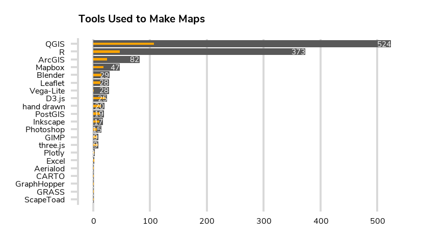
One really surprising aspect of the statistics and the whole challenge was the variety of tools that was used. Biggest surprises to me were popularity of R, difference between ArcGIS and QGIS and also the lack of Python based visualizations.

After the challenge I was about to make a collection with some of my favorite maps, but soon realised that it would be almost impossible to put the entries in some kind of an order for a few reasons. Some people spent hours on each map, whereas others posted a few maps in 15 minutes. Others focused very much on the visual aspect of the maps, whereas others were more on the data-analysis side. Additionally some people were professionals in the field and some published their very first maps. I think everyone who published even a single map should deserve a mention.
If you want to browse the maps, you can search for the hashtag on Twitter. David Friggens has a gallery about the maps on his site, but another one worth mentioning is the Tableau collection by Aurelien Chaumet. One really stunning set of maps was produced by Jo Wood, Professor of Visual Analytic who also published a GitHub repo of all of his maps with code!

Bigger and better in 2020
As the popularity of the challenge went above all expectations, I am planning to organize the challenge in November 2020. Few improvements will be made, of course, but one thing won’t change: doing 30 maps in one month is a very tough task, but I aim to keep it that way.
I will be moving the materials from a single tweet to GitHub and have it organized in a similar fashion to Tidy Tuesday data challenge. I have already set up a repository and now I am inviting all of you to contribute to building the challenge, for example by suggesting categories or datasets that could be used. My aim is to have the repository ready with categories 1st of October 2020.
The #30DayMapChallenge really showed the power of the global mapping community. Thank you for participating and let’s do it bigger and better in 2020!
